

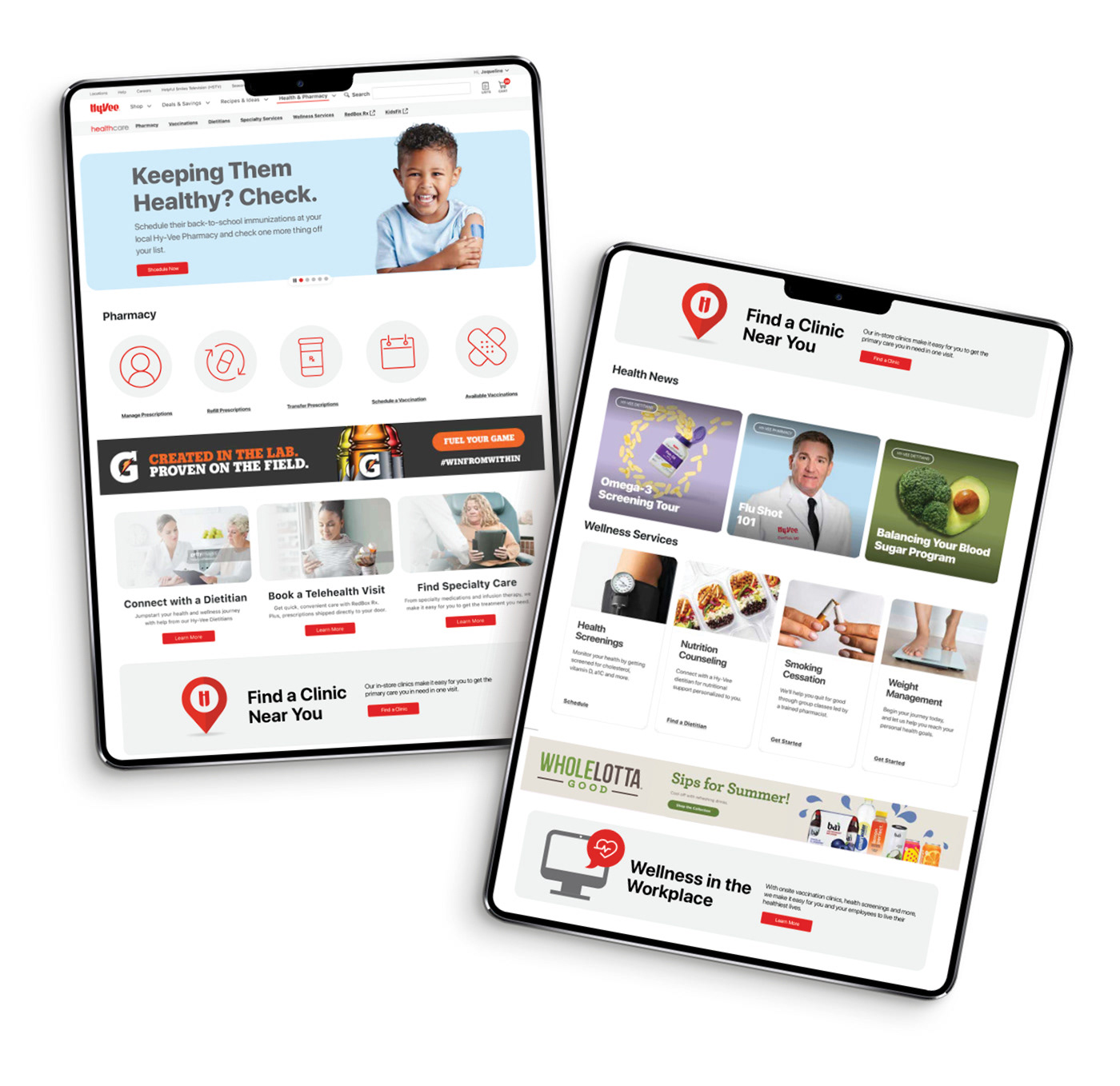
CHALLENGE:
The Hy-Vee Health page needed a complete overhaul. Not only was it clunky to navigate, the most important information was getting lost. We kicked off the overhaul with the landing page, which I was lucky to be a part of.
SOLUTION:
We took a good look at what parts of the current health page were getting the most clicks based on data. From there we combined that information with our internal big push items in this category and our UX team worked up some wireframes. I worked closely with our brand manager and our communications team to make sure the layout hit the mark and then designed all of the content to place on this page. We went for a clean, streamlined look while also adding a few pops of color to help draw the viewers eye in. Overall it is a much better experience for our customers to navigate and quickly find what they need.
Company: Hy-Vee, Inc.
Creative Direction: Chelsea Kumbera